Angular 7 - Sign up form (Material design)
This gives you idea about how to create a sample signup form in Angular 7 material design.
Aim:
- Get familiar with the angular material component usages for sign up.
- Handling of form validations.
- Redirect to desired page if validation succeeds.
Before start:
- Setup of angular 7 project.
- Setup of Angular material design
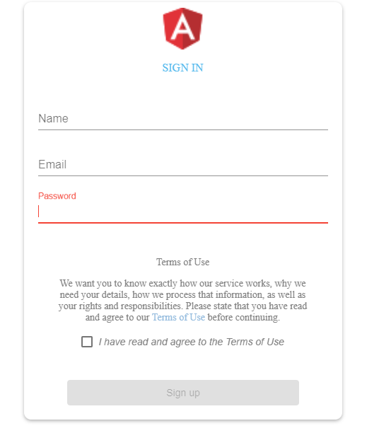
Our final output will be a flying popup with signup page.
The major components are
1) signup.module
import { NgModule } from '@angular/core' import { CommonModule } from '@angular/common';
import { SignupRoutingModule } from './signup-routing.module';
import { SignupComponent } from './signup.component';
import { MaterialDesignModule } from 'src/app/shared/modules/materialdesign.module';
@NgModule({
imports: [
CommonModule,
SignupRoutingModule,
MaterialDesignModule],
declarations: [SignupComponent]
})
export class SignupModule { }
2) materialdesign.module
import { NgModule } from "@angular/core";
import { CommonModule } from '@angular/common';
import { FlexLayoutModule } from '@angular/flex-layout';
import { FormsModule, ReactiveFormsModule } from '@angular/forms';
import {
MatButtonModule, MatCardModule, MatCheckboxModule, MatInputModule,
MatToolbarModule, MatMenuModule,MatIconModule,MatProgressSpinnerModule} from '@angular/material';
@NgModule({
imports: [
FormsModule,
ReactiveFormsModule ,
CommonModule,
MatCheckboxModule,
MatToolbarModule,
MatButtonModule,
MatCardModule,
MatInputModule,
MatMenuModule,
MatIconModule,
FlexLayoutModule
],
exports: [
FormsModule,
ReactiveFormsModule ,
CommonModule,
MatCheckboxModule,
MatToolbarModule,
MatButtonModule,
MatCardModule,
MatInputModule,
MatMenuModule,
MatIconModule,
FlexLayoutModule
],
})
export class MaterialDesignModule{}
3) signup.component.html
<div class="wrapper fadeInDown zero-raduis">
<div id="formContent">
<div class="fadeIn first">
<img src="../../../favicon.ico" id="icon" alt="User Icon" /><br/>
<h2>Sign In</h2>
</div>
<form style="padding:20px" [formGroup]="userSignin">
<div fxLayout="column">
<mat-form-field >
<mat-label>Name</mat-label>
<input matInput class="fadeIn fourth zero-raduis" formControlName="name">
</mat-form-field>
<mat-form-field>
<mat-label>Email</mat-label>
<input matInput class="fadeIn second zero-raduis" formControlName="email" >
</mat-form-field>
<mat-form-field>
<mat-label>Password</mat-label>
<input type='password' matInput class="fadeIn third zero-raduis" formControlName="password">
</mat-form-field>
</div>
<div class="c-privacy-settings">
<div>
<header class="c-privacy-settings__header">Terms of Use</header>
<p class="c-privacy-settings__text">
We want you to know exactly how our service works, why we need your details,
how we process that information, as well as your rights and responsibilities.
Please state that you have read and agree to our
<a href="#" target="_blank">Terms of Use</a> before continuing.
</p>
<div class="c-privacy-settings__setting">
<label for="tos-agreed" class="c-privacy-settings__checkbox">
<mat-checkbox formControlName="termsAndCondition"><em>I have read and agree to the Terms of Use</em></mat-checkbox>
</label>
</div>
</div>
</div>
<button mat-raised-button color="primary" (click)="onSignUp()" class='signup' [disabled]="!userSignin.valid">Sign up</button>
</form>
</div>
</div>
4) signup.component.ts
import { Component, OnInit } from '@angular/core';
import { Router } from '@angular/router';
import { FormGroup, FormControl, Validators } from '@angular/forms';
@Component({
selector: 'app-signup',
templateUrl: './signup.component.html',
styleUrls: ['./signup.component.scss']
})
export class SignupComponent implements OnInit {
userSignin = new FormGroup(
{
name: new FormControl('',[Validators.required]),
email: new FormControl('',[Validators.required]),
password: new FormControl('',[Validators.required]),
termsAndCondition: new FormControl('',[Validators.required])
});
constructor(public router : Router) { }
ngOnInit() { }
onSignUp() {
console.log(this.userSignin.value);
localStorage.setItem('isLoggedin', 'true');
this.router.navigate(['/dashboard']);
}
}
5) signup.component.scss
$color_1: #92badd;
$color_2: #56baed;
$color_3: #cccccc;
$color_4: #0d0d0d;
$color_5: white;
$background_color_1: #56baed;
$background_color_2: #39ace7;
$background_color_3: #f6f6f6;
$background_color_4: #fff;
@-webkit-keyframes fadeInDown {
0% {
opacity: 0;
-webkit-transform: translate3d(0, -100%, 0);
transform: translate3d(0, -100%, 0);
}
100% {
opacity: 1;
-webkit-transform: none;
transform: none;
}
}@keyframes fadeInDown {
0% {
opacity: 0;
-webkit-transform: translate3d(0, -100%, 0);
transform: translate3d(0, -100%, 0);
}
100% {
opacity: 1;
-webkit-transform: none;
transform: none;
}
}/* Simple CSS3 Fade-in Animation */@-webkit-keyframes fadeIn {
from {
opacity: 0;
}
to {
opacity: 1;
}
}@-moz-keyframes fadeIn {
from {
opacity: 0;
}
to {
opacity: 1;
}
}@keyframes fadeIn {
from {
opacity: 0;
}
to {
opacity: 1;
}
}/* Simple CSS3 Fade-in Animation *//* OTHERS */.zero-raduis {
border-radius: 0px !important;
}a {
color: $color_1;
display: inline-block;
text-decoration: none;
font-weight: 400;
}h2 {
text-align: center;
font-size: 16px;
font-weight: 500;
text-transform: uppercase;
display: inline-block;
color: $color_2;
}.wrapper {
display: flex;
align-items: center;
flex-direction: column;
justify-content: center;
width: 100%;
min-height: 100%;
padding: 20px;
}#formContent {
-webkit-border-radius: 10px 10px 10px 10px;
border-radius: 10px 10px 10px 10px;
background: #fff;
padding: 30px;
width: 90%;
max-width: 450px;
position: relative;
padding: 0px;
-webkit-box-shadow: 0 2px 5px 0 rgba(0,0,0,0.3);
box-shadow: 0 2px 5px 0 rgba(0,0,0,0.3);
text-align: center;
}#formFooter {
padding: 2px;
text-align: right;
width: 90%;
}h2.inactive {
color: $color_3;
}h2.active {
color: $color_4;
border-bottom: 2px solid #5fbae9;
}input[type=button] {
background-color: $background_color_1;
border: none;
color: $color_5;
width: 85%;
padding: 10px 25px;
text-align: center;
text-decoration: none;
display: inline-block;
text-transform: uppercase;
font-size: 16px;
cursor: pointer;
-webkit-border-radius: 5px 5px 5px 5px;
border-radius: 5px 5px 5px 5px;
margin: 5px 20px 40px 20px;
-webkit-transition: all 0.3s ease-in-out;
-moz-transition: all 0.3s ease-in-out;
-ms-transition: all 0.3s ease-in-out;
-o-transition: all 0.3s ease-in-out;
transition: all 0.3s ease-in-out;
&:hover {
background-color: $background_color_2;
}
&:active {
-moz-transform: scale(0.95);
-webkit-transform: scale(0.95);
-o-transform: scale(0.95);
-ms-transform: scale(0.95);
transform: scale(0.95);
}
}input[type=submit] {
background-color: $background_color_1;
border: none;
color: $color_5;
width: 85%;
padding: 10px 25px;
text-align: center;
text-decoration: none;
display: inline-block;
text-transform: uppercase;
font-size: 16px;
cursor: pointer;
-webkit-border-radius: 5px 5px 5px 5px;
border-radius: 5px 5px 5px 5px;
margin: 5px 20px 40px 20px;
-webkit-transition: all 0.3s ease-in-out;
-moz-transition: all 0.3s ease-in-out;
-ms-transition: all 0.3s ease-in-out;
-o-transition: all 0.3s ease-in-out;
transition: all 0.3s ease-in-out;
&:hover {
background-color: $background_color_2;
}
&:active {
-moz-transform: scale(0.95);
-webkit-transform: scale(0.95);
-o-transform: scale(0.95);
-ms-transform: scale(0.95);
transform: scale(0.95);
}
}input[type=reset] {
background-color: $background_color_1;
border: none;
color: $color_5;
width: 85%;
padding: 10px 25px;
text-align: center;
text-decoration: none;
display: inline-block;
text-transform: uppercase;
font-size: 16px;
cursor: pointer;
-webkit-border-radius: 5px 5px 5px 5px;
border-radius: 5px 5px 5px 5px;
margin: 5px 20px 40px 20px;
-webkit-transition: all 0.3s ease-in-out;
-moz-transition: all 0.3s ease-in-out;
-ms-transition: all 0.3s ease-in-out;
-o-transition: all 0.3s ease-in-out;
transition: all 0.3s ease-in-out;
&:hover {
background-color: $background_color_2;
}
&:active {
-moz-transform: scale(0.95);
-webkit-transform: scale(0.95);
-o-transform: scale(0.95);
-ms-transform: scale(0.95);
transform: scale(0.95);
}
}input[type=text] {
background-color: $background_color_3;
border: none;
color: $color_4;
padding: 10px 25px;
text-align: center;
text-decoration: none;
display: inline-block;
font-size: 16px;
margin: 5px;
width: 85%;
border: 2px solid #f6f6f6;
-webkit-transition: all 0.5s ease-in-out;
-moz-transition: all 0.5s ease-in-out;
-ms-transition: all 0.5s ease-in-out;
-o-transition: all 0.5s ease-in-out;
transition: all 0.5s ease-in-out;
-webkit-border-radius: 5px 5px 5px 5px;
border-radius: 5px 5px 5px 5px;
&:focus {
background-color: $background_color_4;
border-bottom: 2px solid #5fbae9;
}
&:placeholder {
color: $color_3;
}
}input[type=email] {
background-color: $background_color_3;
border: none;
color: $color_4;
padding: 10px 25px;
text-align: center;
text-decoration: none;
display: inline-block;
font-size: 16px;
margin: 5px;
width: 85%;
border: 2px solid #f6f6f6;
-webkit-transition: all 0.5s ease-in-out;
-moz-transition: all 0.5s ease-in-out;
-ms-transition: all 0.5s ease-in-out;
-o-transition: all 0.5s ease-in-out;
transition: all 0.5s ease-in-out;
-webkit-border-radius: 5px 5px 5px 5px;
border-radius: 5px 5px 5px 5px;
&:focus {
background-color: $background_color_4;
border-bottom: 2px solid #5fbae9;
}
&:placeholder {
color: $color_3;
}
}.fadeInDown {
-webkit-animation-name: fadeInDown;
animation-name: fadeInDown;
-webkit-animation-duration: 1s;
animation-duration: 1s;
-webkit-animation-fill-mode: both;
animation-fill-mode: both;
}.fadeIn {
opacity: 0;
-webkit-animation: fadeIn ease-in 1;
-moz-animation: fadeIn ease-in 1;
animation: fadeIn ease-in 1;
-webkit-animation-fill-mode: forwards;
-moz-animation-fill-mode: forwards;
animation-fill-mode: forwards;
-webkit-animation-duration: 1s;
-moz-animation-duration: 1s;
animation-duration: 1s;
}.fadeIn.first {
-webkit-animation-delay: 0.4s;
-moz-animation-delay: 0.4s;
animation-delay: 0.4s;
}.fadeIn.second {
-webkit-animation-delay: 0.6s;
-moz-animation-delay: 0.6s;
animation-delay: 0.6s;
}.fadeIn.third {
-webkit-animation-delay: 0.8s;
-moz-animation-delay: 0.8s;
animation-delay: 0.8s;
}.fadeIn.fourth {
-webkit-animation-delay: 1s;
-moz-animation-delay: 1s;
animation-delay: 1s;
}.underlineHover {
&:after {
display: block;
width: 0;
height: 2px;
background-color: $background_color_1;
content: "";
transition: width 0.2s;
}
&:hover {
color: $color_4;
&:after {
width: 100%;
}
}
}* {
&:focus {
outline: none;
}
}#icon {
width: 13%;
margin-top: 8px;
}.signup{
width:80%;
}
Cheers ✌
Comments
Post a Comment